
Different Kinds of Graphs To Visualize Trends Easily
Many of us are visual thinkers and so we can grasp information more easily when it is presented graphically. When data is illustrated visually on the graph its interpretation becomes easier and there is a greater chance of recollecting the figures & facts mentioned therewith. Graphs were invented by William Playfair in around 1786, who was a Scottish Engineer and Political Economist. It came into existence to solve some real-world problems that involved relationship and correspondence between entities. Ever since then, graphs have proved to be a mighty tool to represent data and analyze it for various findings.
Different Types of Graphs
Different types of Graphs are used for various purposes depending on the number of criteria you want to represent and the level of experience of your audiences. Let us highlight some of the most common graphs taught in K-12 schools across Dubai and other Middle East regions.
Bar Graph
This is the most commonly used Graph type to compare data across parameters. The rectangular shaped bars are usually arranged vertically and each bar is equidistant from the other. The width of every bar on the graph is the same in measurement, however, the heights vary depending on the quantitative aspect of information. The general thumb rule for most Bar Graphs is that the categories that are to be compared are represented on the horizontal axis, while the numeric values are represented on the vertical axis.

As we can see from the above example of the Bar Graph chart, in the first quarter, students who attended Dance class are as follows.
January – 40 students
February – 50 students
March – 60 students
Line Graph
The line graph or line chart computes data recorded over a period of time. It is represented by a series of dots joining each other to show the ups and downs in the trend. The independent variables such as (months, days, and, years) are represented on the horizontal axis, while the dependent variables or number values such as (score, percentage, and currency) are represented on the vertical axis. Each position of a point on the graph denotes the change in the independent variable with respect to the dependent variable. If this may sound confusing, let us illustrate with the help of an example.

As we can see from the above reading that in June month, Dubai, receives 12 hours of sunshine vs. 8 hours in December, January, and February months. From the trend, we found out that during winter months the sun shines for lesser hours, than in summer months. Line charts are commonly used by economists, data scientists, analysts, and financial advisors, to effectively decode trends in a precise and accurate manner.
Pie Chart
We are well aware that the pie chart is circular in shape and each slice of the pie shows the respective data size, from the whole unit. Pie charts can be used to depict percentages of variables, from the whole (100%). When you have the chance to glance at a pie chart, you can quickly tell which criteria occupies the largest proportion of the share and which one has minuscule significance. This breakdown helps to consume information visually, rather than reading through lengthy paragraphs from a document or a report. Pie charts can be found in school textbooks, in newspapers, and even on social media (especially LinkedIn) to draw attention towards important subject matters.

A balance in carbohydrates, fats and protein, leads to a healthy diet plan. The above example suggests to the reader, that to live an active lifestyle with ample energy, one needs to consume 45% of carbohydrates, 30% of fats 25% of proteins throughout the day, across various meals. See how simple it is!
Area Chart
Similar to the line graph, the area chart also shows the series of movements across points. The area under the line is colored and reveals to us the volume of data. A stacked chart has the area value stacked on top of each other, across the X-axis and Y-axis.
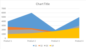
Try to analyze this chart mentally and write down the pointers on a notepad. If it matched the below findings, then you are on the right track.
- Product 2 has the highest sales in Q1 across the UAE.
- Q2 sales for products dip lower and lower
- Q4 shows gradual increase in sales.
Mathseeds is a platform developed to fulfill the thrust of knowledge amongst eager Math learners. The lessons are structured in a one-on-one fashion, such that special attention is paid to each child which improves their preparedness. Learning graphs can now be discovered under one of their modules which is designed in a way that is easy to understand and practice. Parents and teachers in the GCC regions, highly promote Mathseeds amongst kids of 3 to 9 years of age.